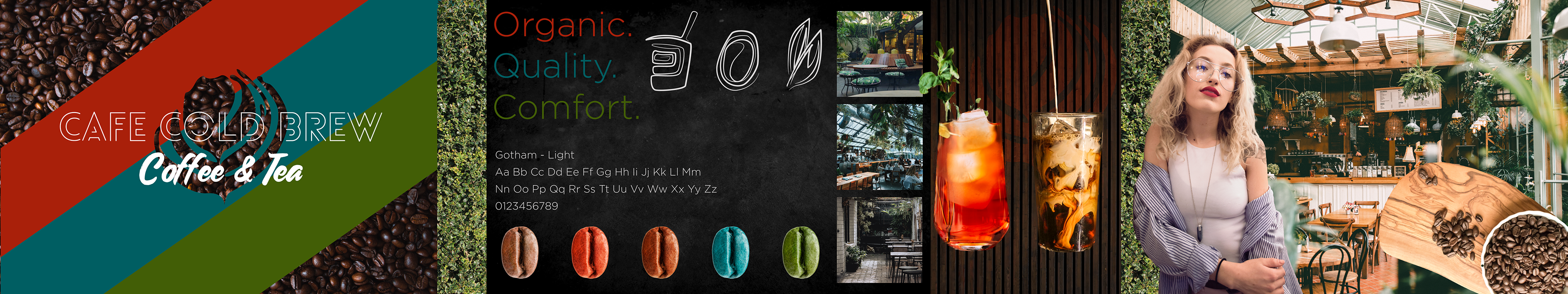
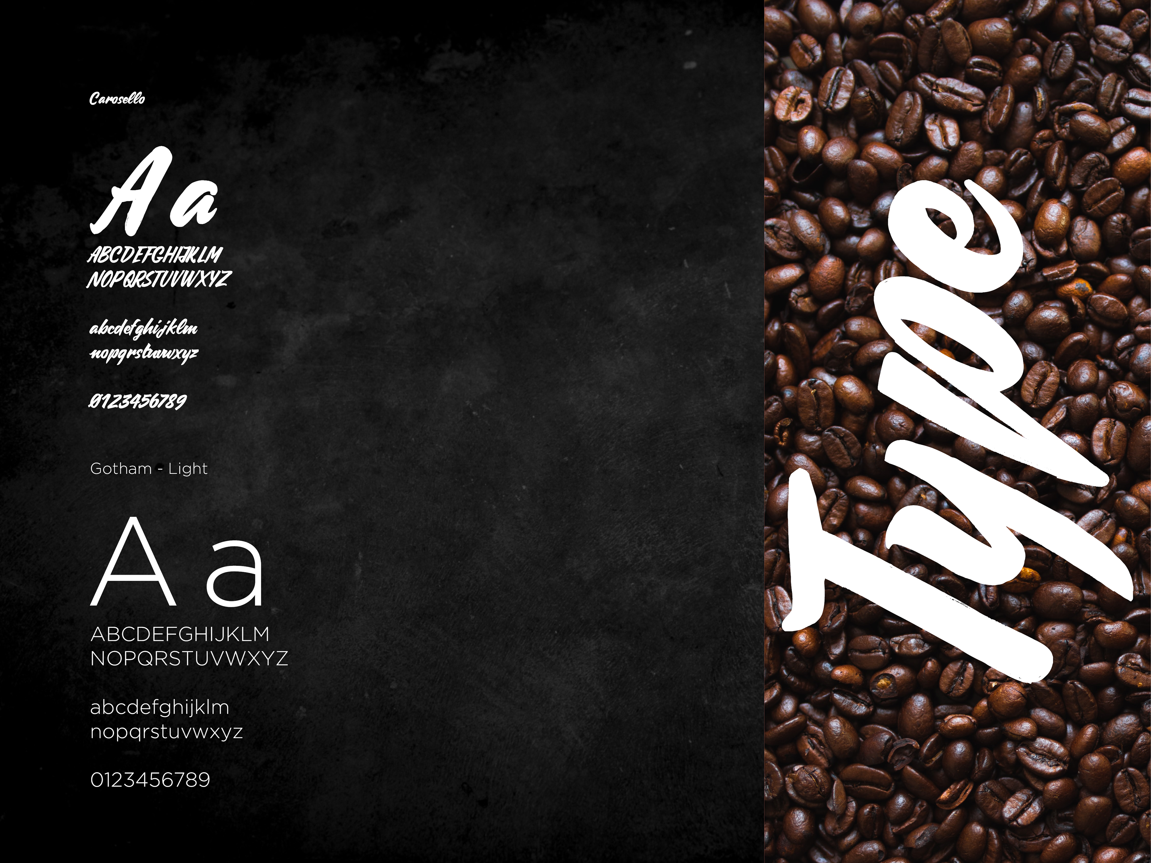
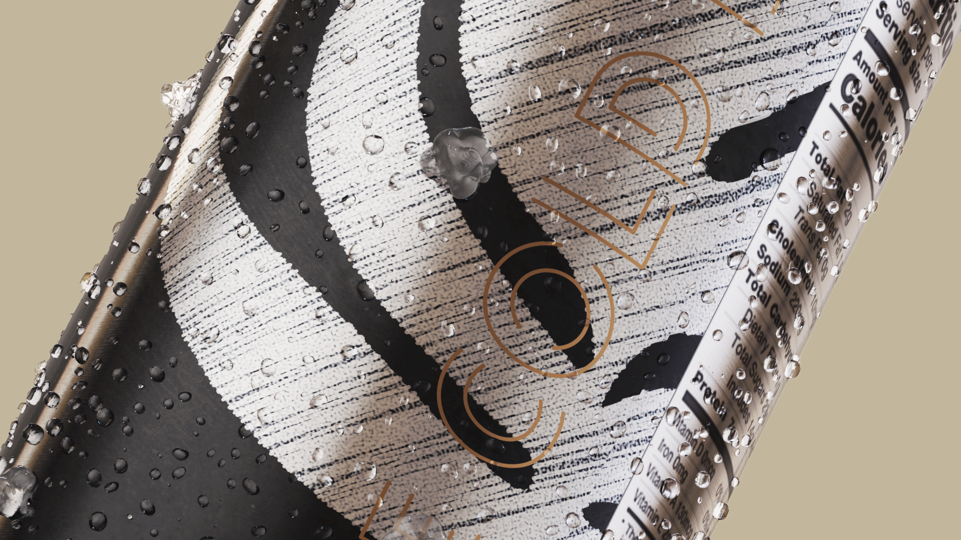
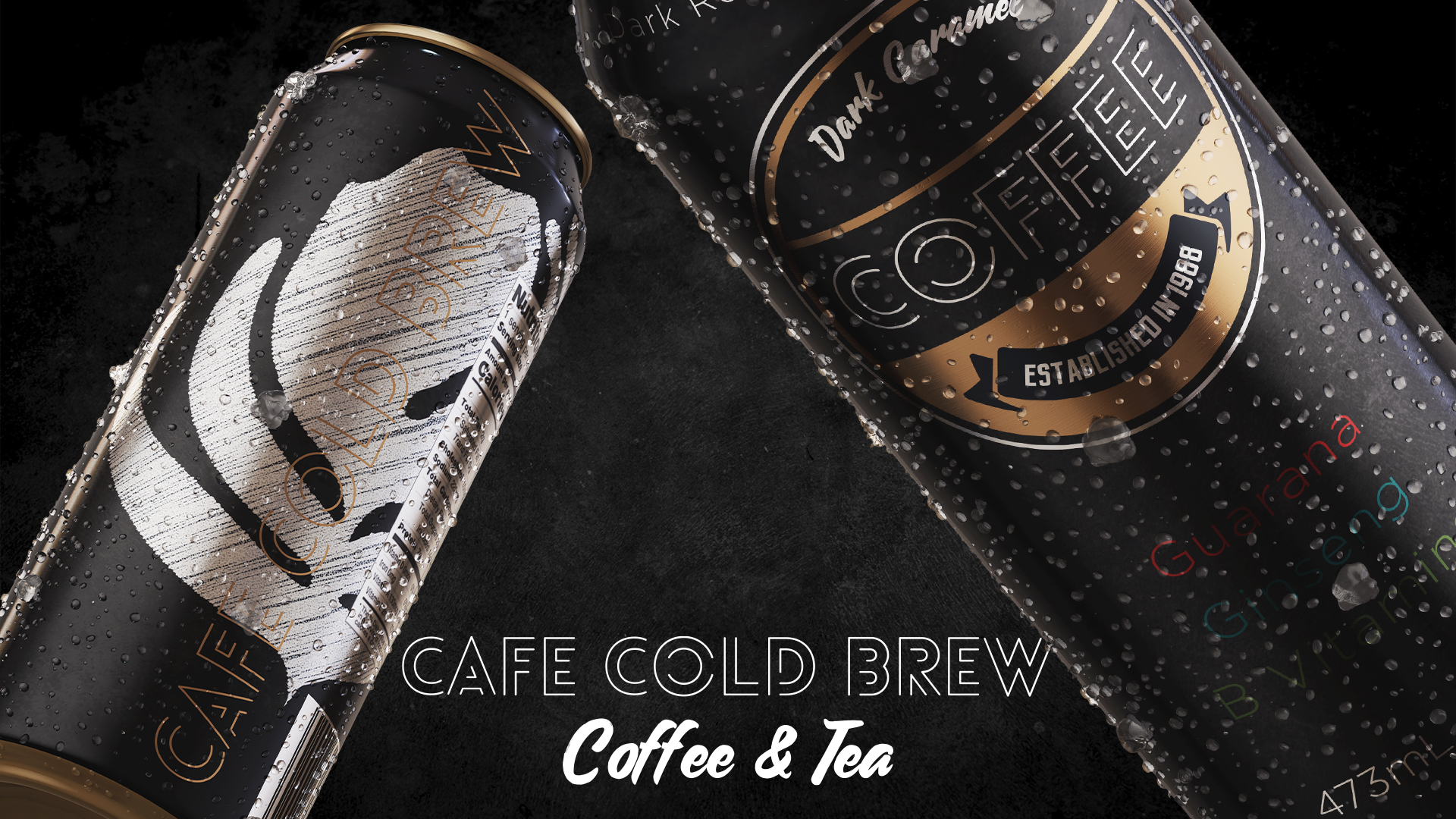
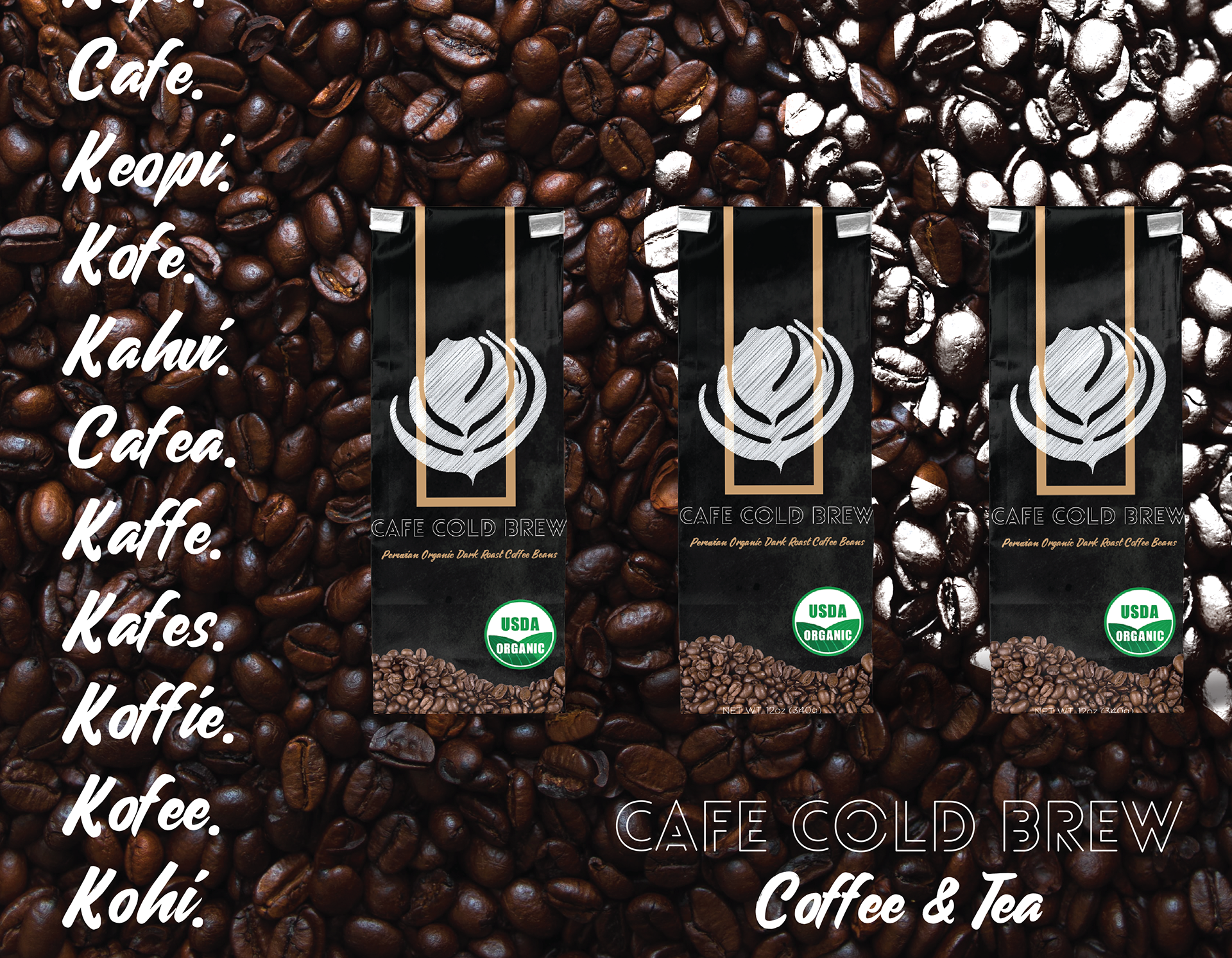
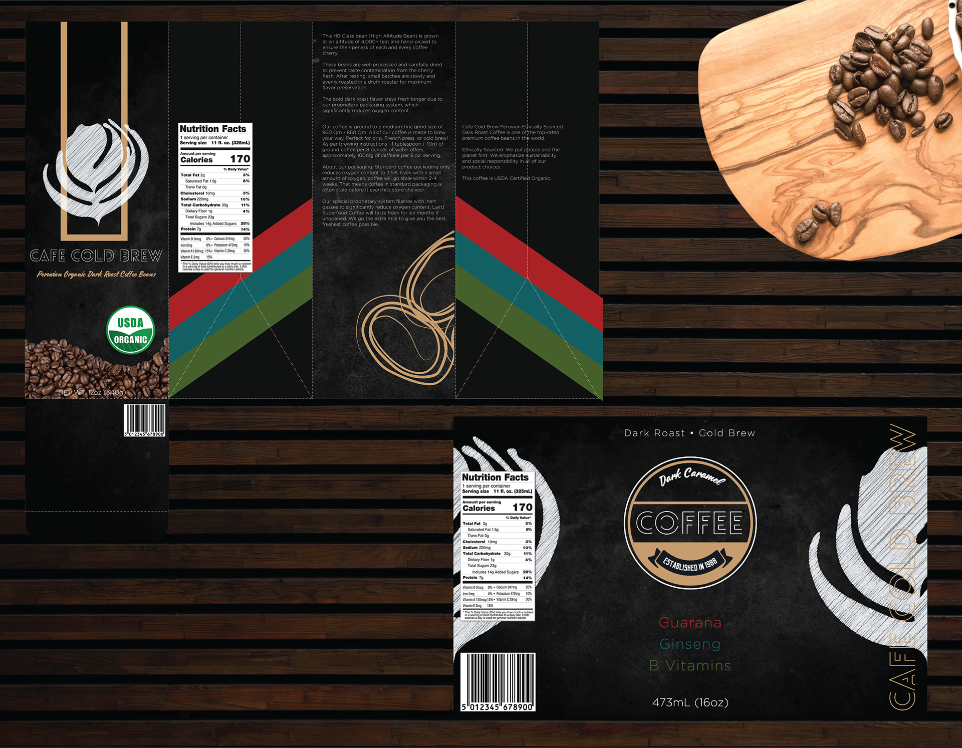
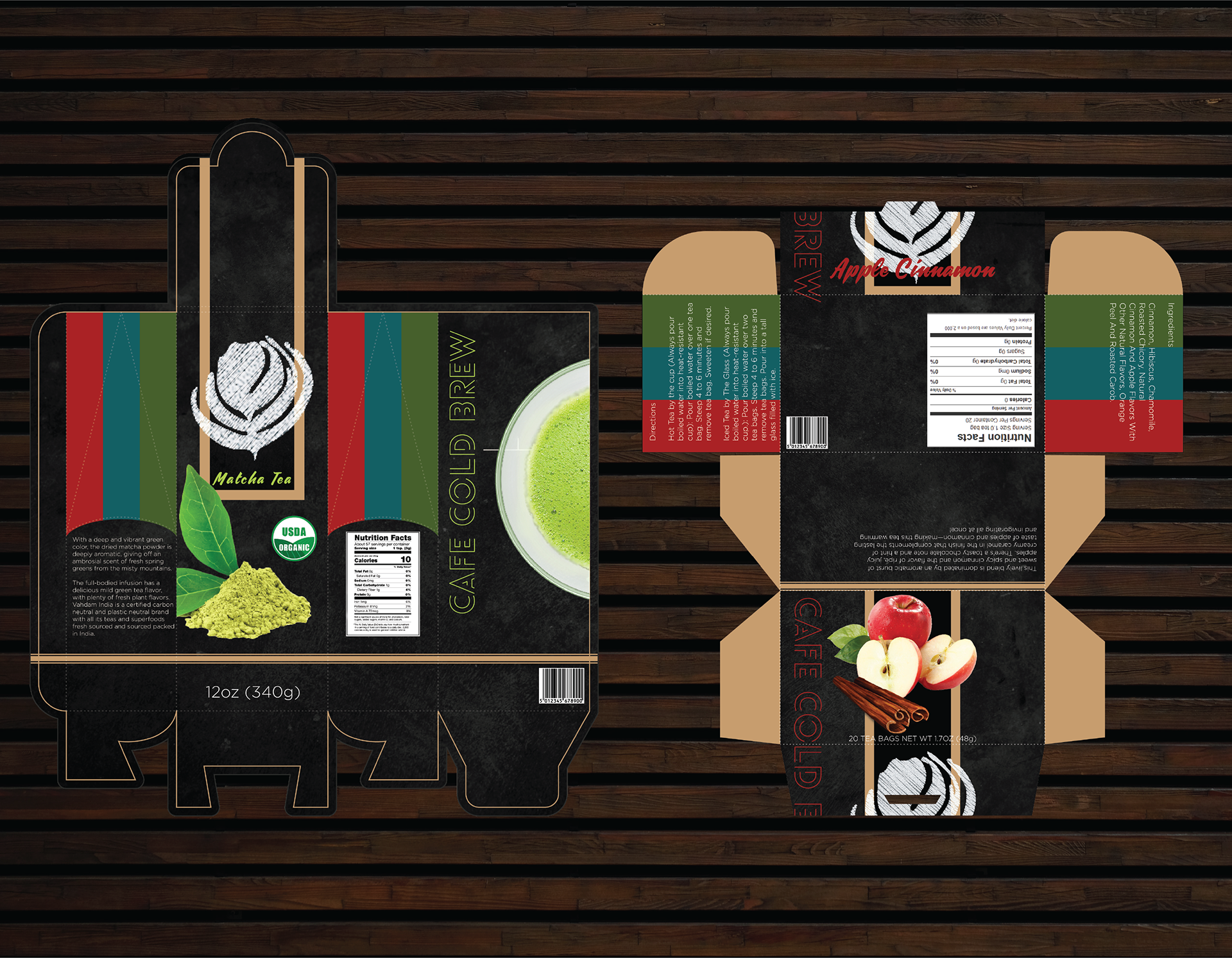
For the headers, I use Carosello. This is a beautiful typeface that has wonderful swooping lines and a very hand drawn feel to the letter forms. I feel this pairs nicely with the choice of using the chalkboard and gives a nice bit of chemistry when used together. For the body, I chose Gotham - Light which is more legible, but still thin and elegant. I feel this offsets the almost stylized use of the script letter form in a very nice way. The letter form I used in the main logo is a secret. (It's Lovelo. I absolutely adore the way that font looks. Shout out to Satori Graphics for finding the best free fonts on the web).
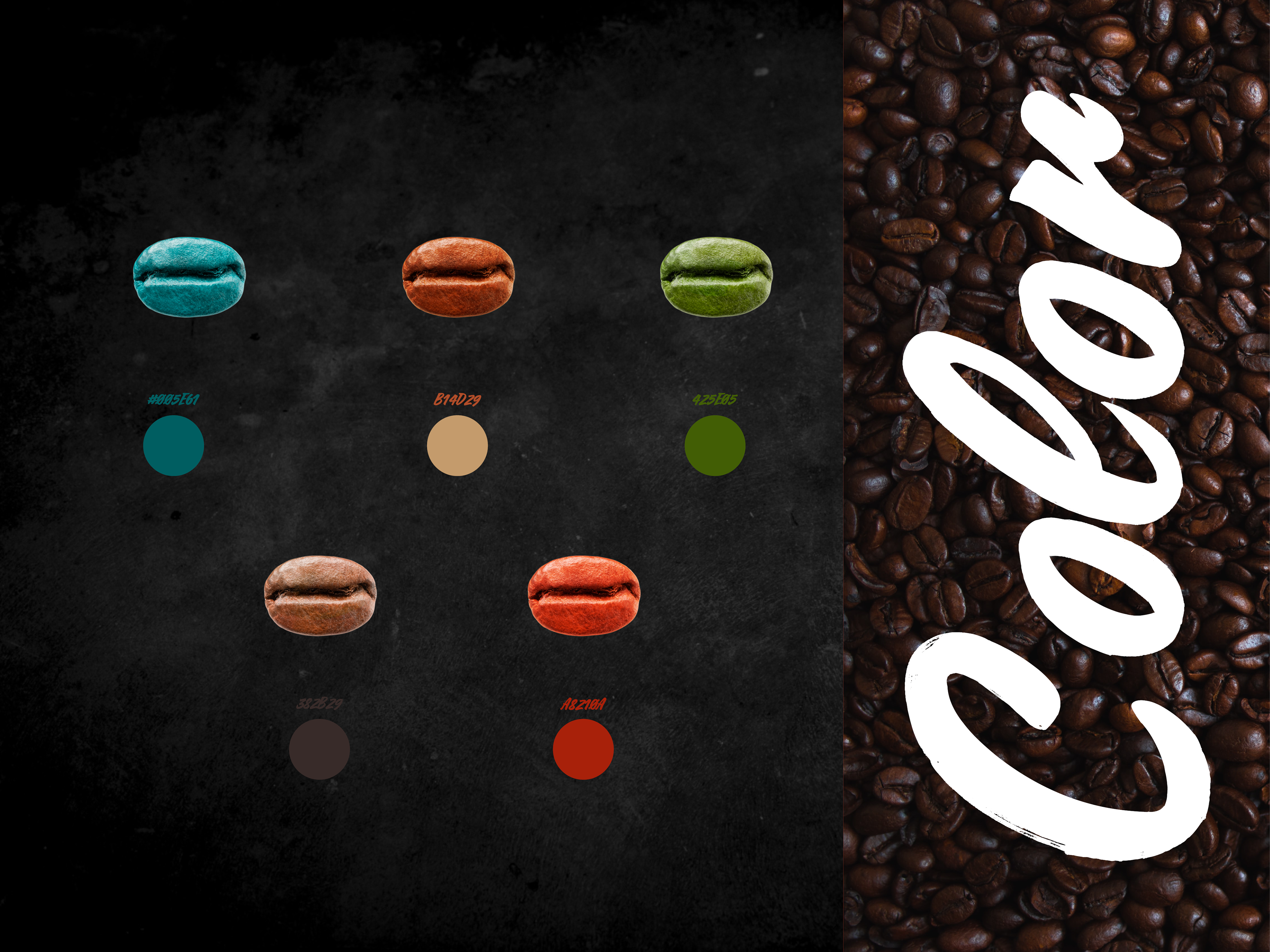
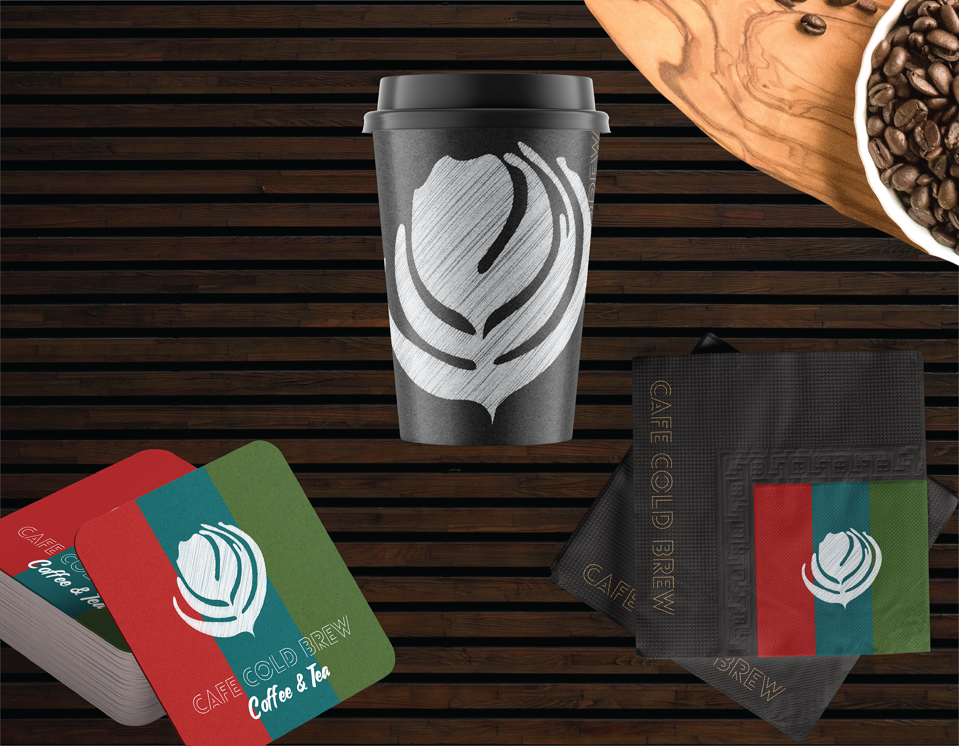
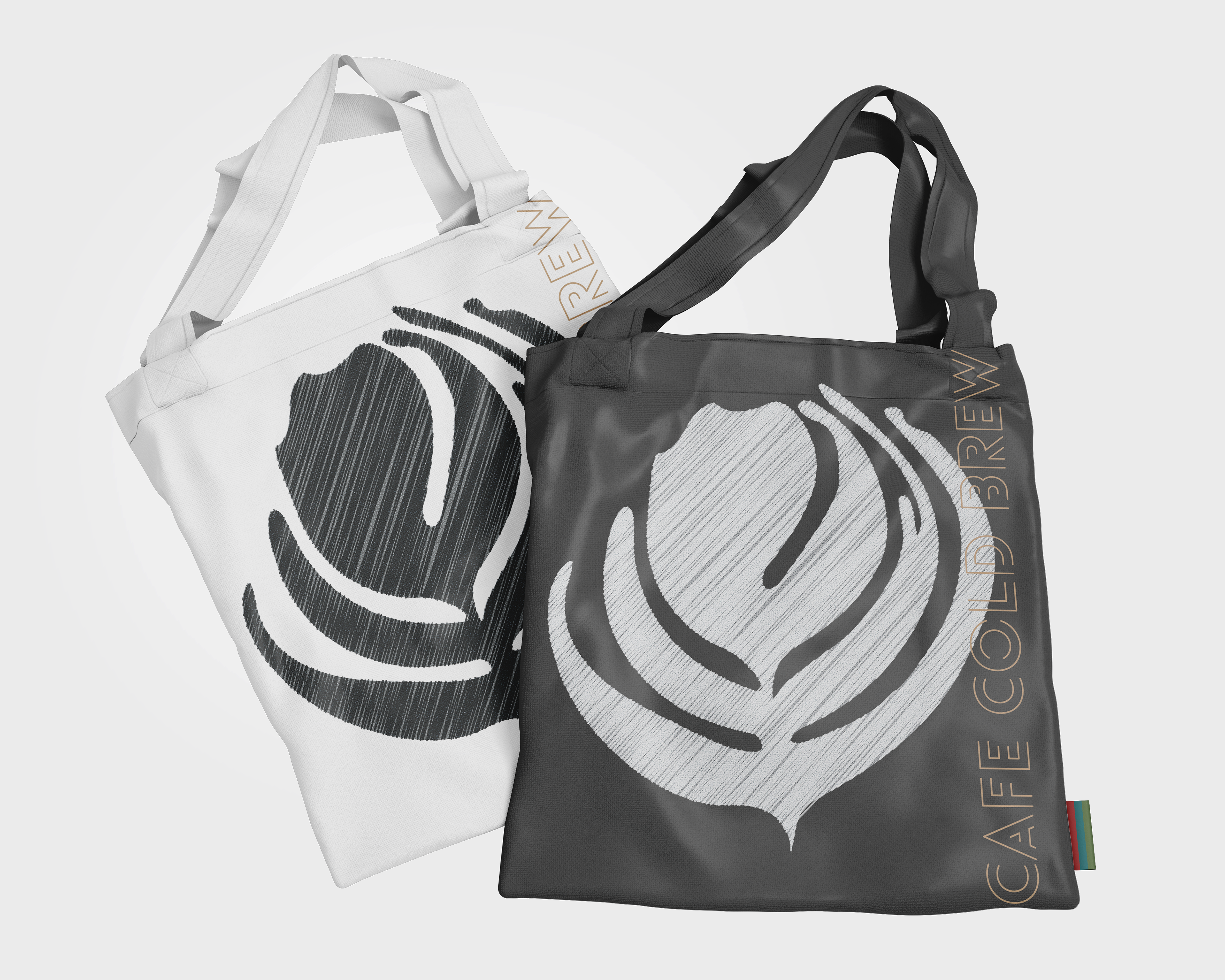
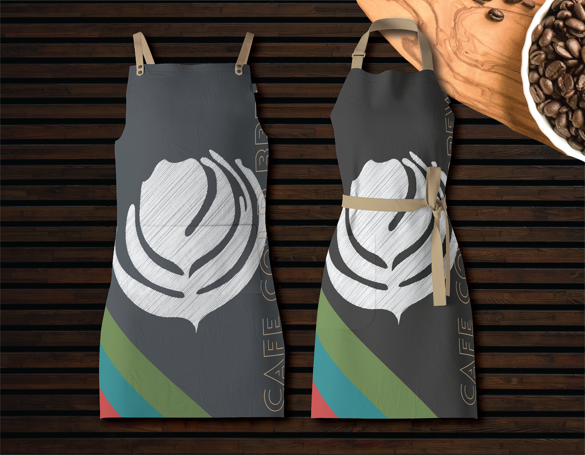
As for the colors? I wanted to use mostly earthy and almost dull colors. Similar to what you might find in mid-century modern work. I offset those muddy colors with a very bright reddish orange and teal.
While I may not have used the extended palette much, I tried to challenge myself to use more that the standard 'Smokey and the Bandit' black and gold. I always find myself diverting back to color combinations the auto industry uses.

That's it. That's all I've got.
Thank you so much for taking that time to scroll through my work.
If you have any questions let me know and I'll get back to you with an answer.